Advanced button customization
Updated April 22, 2026
Style your Primary and Secondary buttons independently with full control over colors, typography, and sizing
Buttons are one of the first things customers interact with on your shop. With Advanced Button Customization, you can style your Primary and Secondary buttons separately, giving you full control over how each button type looks and feels. Previously, button styling was limited to adjusting the border radius. Now you can set colors, shape, fill, outline, typography, and sizing for each button type on its own.
Primary vs. Secondary buttons
Your shop uses two button types across its pages:
- Primary buttons are your main calls to action, like "Add to Cart" or "Shop Now." These are the buttons you want to stand out most.
- Secondary buttons are supporting actions, like "View Details" or "Learn More." They complement Primary buttons without competing for attention.
Advanced Button Customization lets you configure each type independently, so your Primary buttons can have a bold, filled look while your Secondary buttons stay subtle with an outline style, or any combination you choose.
Access button styling settings
To open the button customization panel:
- Go to Site Design > Style in your dashboard.
- Scroll to the Buttons section.
- You'll see two tabs: Primary and Secondary. Select the button type you want to customize.
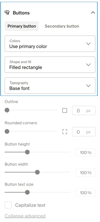
Each tab contains the same set of controls, so you can style both button types using a consistent workflow.
Customize button colors
Under each button tab, you'll find a color dropdown that controls the button's color scheme.
- Button color. Choose between Use primary color (your site's primary accent color) or Use text color (your site's text color). This selection determines the button's fill and text colors together as a coordinated pair.
The button color derives from your site-wide color palette set in Site Design > Style > Colors. For Primary buttons, using the primary color creates a strong visual call to action. For Secondary buttons, the text color option produces a more subtle, understated look.

Set button shape and fill
The shape and fill settings control whether your buttons appear solid, outlined, or somewhere in between.
- Shape and fill. Choose between a Filled rectangle (solid background) or an Outlined rectangle (transparent with a border). The outline color is derived from your button color selection.
- Outline thickness. Control how thick the outline border appears.
Filled buttons work well for Primary actions where you want a strong visual presence. Outlined buttons suit Secondary actions that should be visible but not dominant.
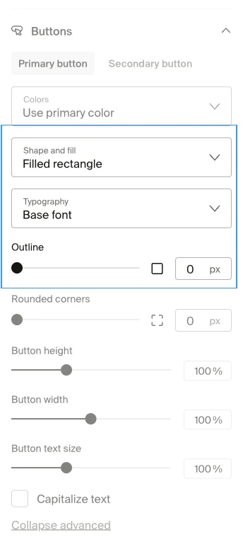
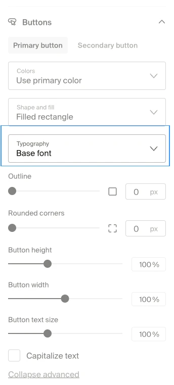
Adjust button typography
Each button type has its own typography settings, letting you match button text to your brand.
- Font. Choose between your site's Base Font or Heading Font. The Base Font is the body text font used across your site. The Heading Font is the one applied to titles and section headers.
- Font size. Increase or decrease the button label size.
- Text capitalization. Toggle whether button text appears in all uppercase or uses its default casing.
If your Heading Font is bold or decorative, try using it on Primary buttons to make them pop. Use the Base Font on Secondary buttons for a cleaner, more understated look.
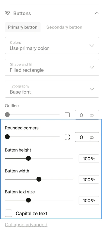
Control button sizing
Sizing settings let you fine-tune the physical dimensions and corner shape of each button type.
- Height. Adjust how tall the button appears.
- Width. Control the horizontal size of the button. Wider buttons can make calls to action more prominent.
- Rounded corners. Set how rounded or square the button corners are, with per-corner control (range 0-120px). A value of 0 gives sharp corners, while higher values create a pill-shaped look.
The corner radius setting here replaces the global Button corner radius found in the older border radius settings. If you've previously set a button corner radius under Style > Border Radius, the new per-button setting takes priority.
Preview and save your changes
After adjusting any button settings, you can see your changes in the live preview on the right side of the site designer.
- Make your adjustments in the Primary or Secondary tab.
- Check the preview to confirm the buttons look the way you want.
- Click Save to apply your changes across your entire shop.
Your updated button styles apply site-wide to all pages, including product pages, collection pages, and the checkout flow.
Frequently Asked Questions
Can I style Primary and Secondary buttons differently?
Yes. Each button type has its own tab with independent controls. Changes to Primary buttons don't affect Secondary buttons, and vice versa.
Do these settings override my existing button corner radius?
Yes. If you previously set a global button corner radius under Style > Border Radius, the per-button corner radius in Advanced Button Customization takes priority.
What fonts are available for buttons?
You can choose between your site's Base Font and Heading Font. These are the same fonts you configure under Site Design > Style > Fonts. To change which fonts are available, update your font selections in the Fonts settings.
Will these changes affect the mobile version of my shop?
Yes. Button styling applies across all devices. Preview your changes on both desktop and mobile views in the site designer before saving.
If you have any questions, do not hesitate to contact us at support@fourthwall.com.