Customize your site colors and product appearance
Updated April 24, 2026
Customize colors, background patterns, and product card appearance across your Fourthwall site
Your site's appearance settings let you control global colors, border styles, and product card designs. Most settings apply site-wide, but you can also override colors within individual sections without any CSS knowledge.
Selecting your site colors
To adjust your site's colors, go to Site Design > Style > Colors. You can change four main elements:
- Primary: Buttons, links, and other key UI elements
- Background: The site's background color
- Text: Body text throughout your site
- Text Over Primary: Text or elements that sit on top of backgrounds using the Primary color
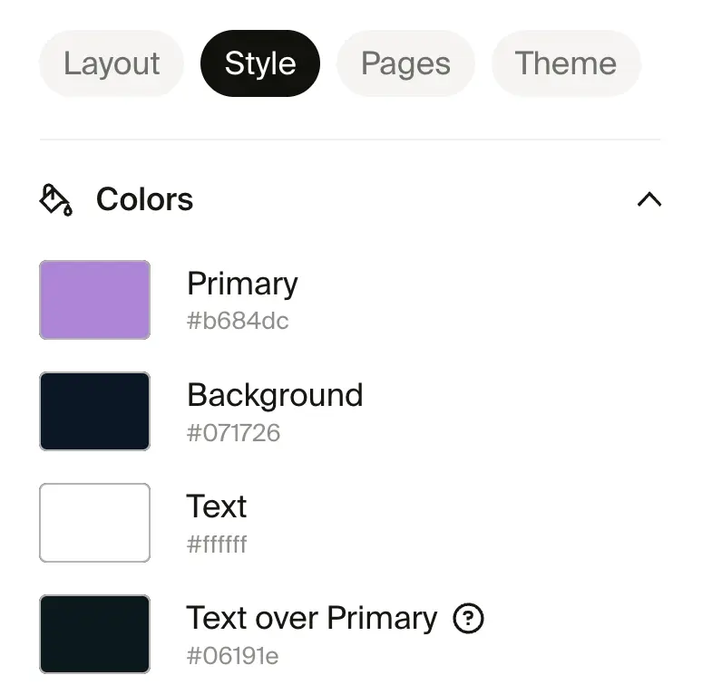
Click a color block to select a new shade or paste in a hex code. If you don't know the exact hex code, use a browser tool like the ColorPick Eyedropper extension.
Overriding colors in specific sections
You can override the four primary colors for individual sections on your site. No CSS knowledge needed. Open a section in the site designer, go to its settings, and look for the color override controls to apply a different color scheme to that section only.
This lets you create contrast between sections, such as a dark hero banner above a light product grid, without changing your site-wide colors.
Setting background visual
Go to Site Design > Style > Background visual and upload an image or pattern to use as the background for your entire site.
Choose from three display styles:
- Static cover: The image covers the full background without repeating.
- Tile (pattern): The image tiles across the background in a repeating pattern.
- Scrolling pattern: The image repeats and scrolls with the page.
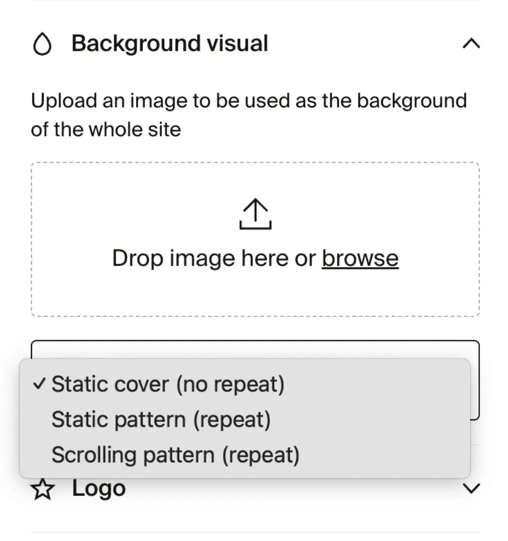
Most modern image file types are supported, including PNG, JPG/JPEG, GIF, SVG, and TIFF. Keep your file size under 4 MB.
Adjusting border radius
The Border radius settings control how rounded or sharp edges appear on different elements.
- Button corner radius: Rounds or squares the edges of buttons.
- Input corner radius: Adjusts corner style for input fields such as donation boxes and checkout fields.
- Image corner radius: Changes the corners of product images from square to rounded.

Customizing product card styles
These settings control how product listings appear on your site, including image ratios, tile sizes, hover effects, and background colors.
- Product photography aspect ratio: Choose between 3:4 (default) and 4:5.
- Product tile size: Adjust the size of product tiles.
- Show available color options: Shows color swatches on product tiles so supporters can see variant options at a glance. On by default. Uncheck to hide swatches.
- Show second photo on hover: Shows an alternate product image when a supporter hovers over a tile. On by default. Uncheck to disable.
- Center products horizontally: Aligns product images at the center of their container.
- Hide promotion badges: Removes promotional labels from products.
- Change product background: Sets a custom background color behind product images.
