Edit the header on your site
Updated August 2, 2026
The Header section of your site plays a key role in navigation and communication with your visitors. It allows you to:
- Display announcements, promotions, and special offers.
- Enable a countdown timer for time-sensitive sales or drops.
- Customize the menu, currency selector, and buttons for easy navigation.

This guide will show you step by step how to create a Header that looks great and boosts conversions.
To access the Header settings within your Fourthwall dashboard, go to Site Design > Layout > Header
Customizing the Header Layout
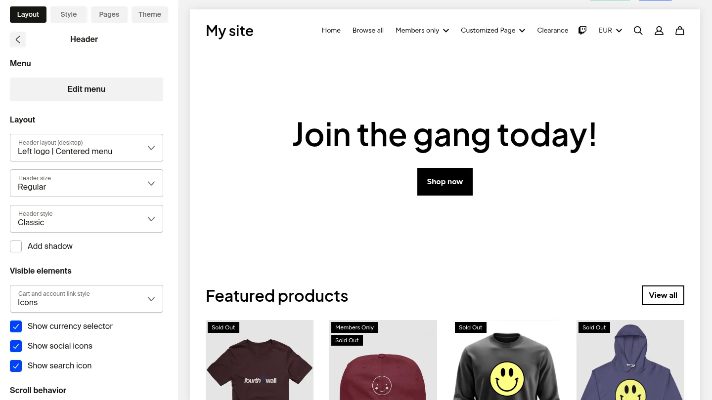
- Edit menu: The first section of the Header settings is the Menu option, which lets you customize your site's navigation. You can edit both the header and footer menus here. To learn more about editing your menus, visit How to edit menu and create drop-down menus.
- Header layout: Choose how your logo and menu are positioned (e.g., Left Logo | Centered Menu).
- Header size: Select the size of your header.
- Header style: Pick between Classic (a full-width bar that spans the top of your site) and Floating (a detached bar with rounded corners and padding around it). See Header style options below for details.
- Cart and account link style: Select icons or text for these elements.
- Show currency selector: Let customers switch between currencies you have enabled on your site so they can see prices and check out in their preferred currency. To learn more about currency selection, check out the Multi-Currency Settings help article.
- Show social icons: Display social media icons in your header. Only the social icons you have added in Site Design > Style > Social Links will appear. To learn how to add social links to your storefront, check out How do I add social links to my storefront?.
- Show search icon: Display a search icon in your header that opens an inline search bar for customers. Shops with 20 or more offers have search enabled by default. You can turn this on or off at any time in the header settings.
- Make the section full width: Expand the header across the full screen.
- Add custom CSS code: Modify header styles beyond built-in options.
- Customize section colors: Adjust colors for better branding.
Header style options
The Header style dropdown sets the overall shape of your header. Each style has its own set of controls.
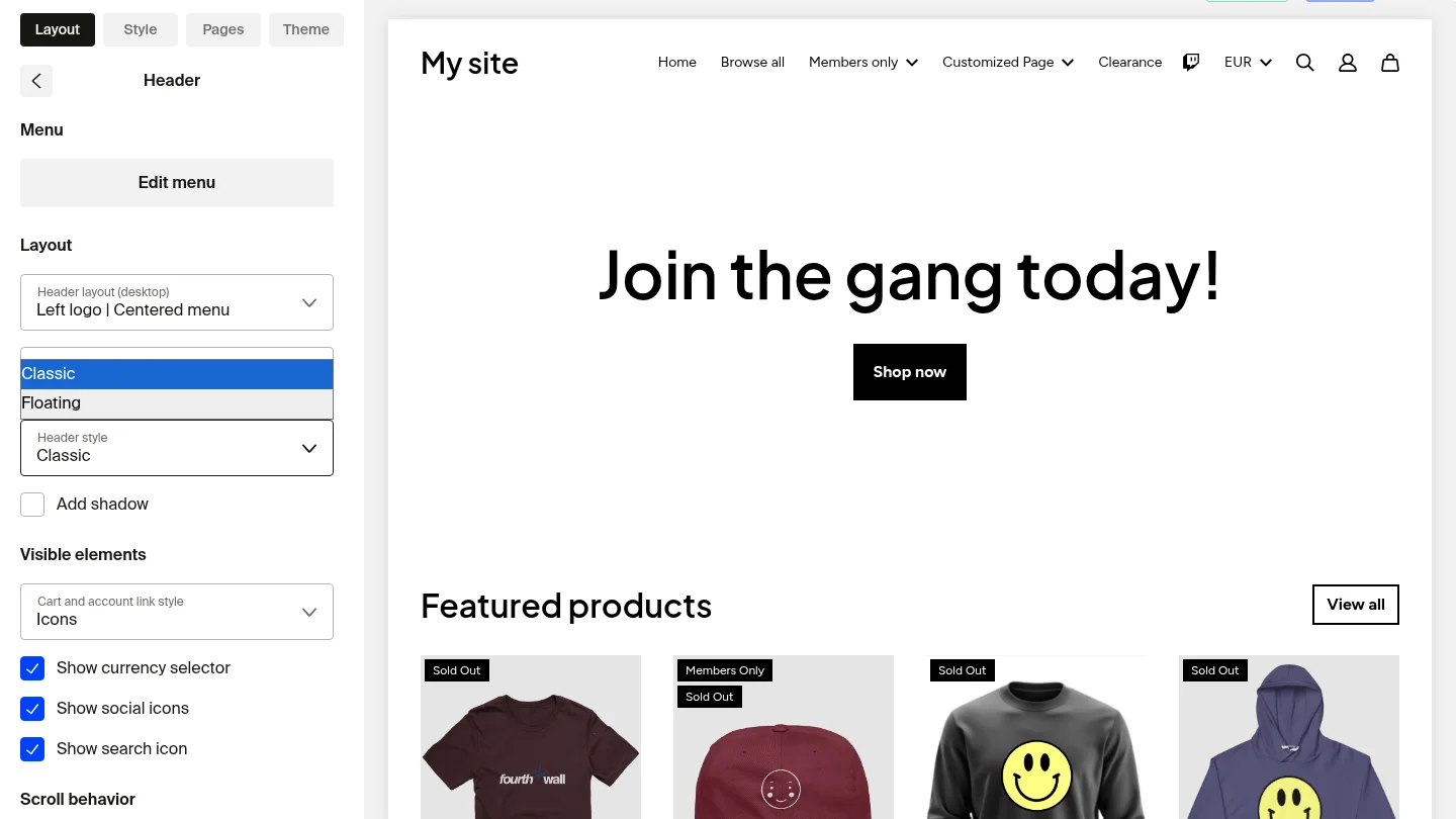
- Classic: A full-width bar that runs edge to edge along the top of your site. This is the default look for most shops.
- Floating: A detached bar that sits inside the page with padding around it and rounded corners. Use this style for a modern, card-like header.
When you select Floating, two extra controls appear:
- Floating header corner radius: Set how rounded the header corners are. Drag the slider or enter a pixel value.
- Padding: Set how much space sits between the floating header and the edges of the page.
You can also layer visual effects on either style:
- Add outline: Draw a thin border around the header.
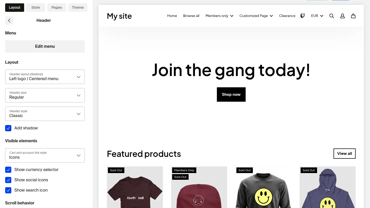
- Add shadow: Drop a soft shadow below the header to lift it off the page.

Scroll behavior
The Scroll behavior section controls how your header acts as customers move down the page.
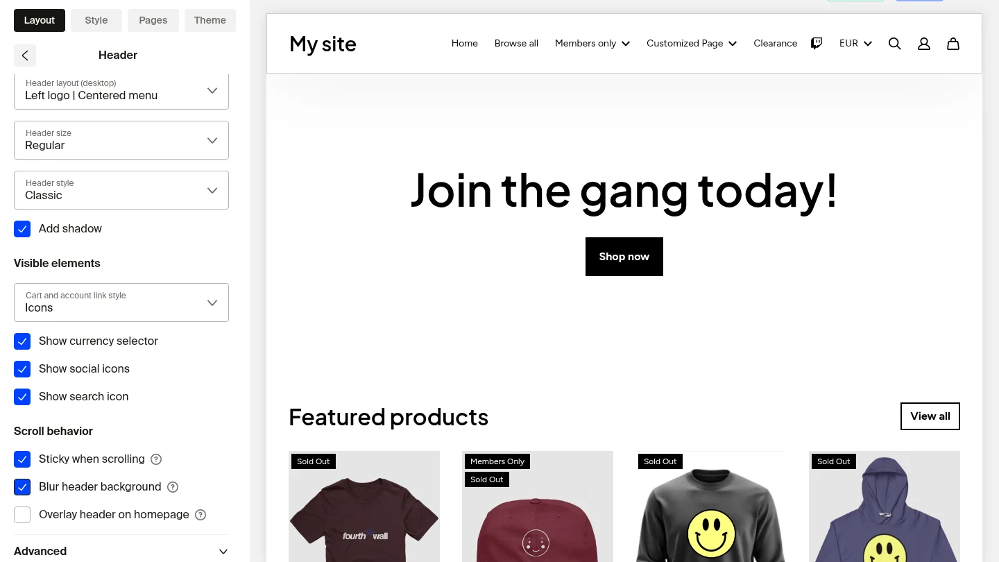
- Sticky when scrolling: Keep the header pinned to the top of the page as visitors scroll. This puts your navigation, cart, and search within reach on every section of your site.
- Blur header background: Apply a frosted-glass effect to the header. Combined with a translucent background color, this creates a high-end glass look as content scrolls behind it.
- Overlay header on homepage: Let your homepage hero content show through the header so the bar blends into the background image or video at the top of the page.
How it looks on mobile
The glass and sticky settings carry through to mobile, so customers see the same polished header on phones and tablets.

Adding an Announcement Bar

The Announcement Bar is perfect for displaying time-sensitive updates like sales, product drops, or free shipping offers. To add it:
-
Click on "Site Design > Layout > Header."
-
Click "Add Header Section."
-
A new window will appear. Select "Announcement Bar" and click "Add."

Customizing the Announcement Bar
Now that you have added the announcement bar, you can customize it as shown below

- Announcement text: Enter the message you want to display in the bar, like "Free shipping for orders of $50 and more" or "New drop is live!" "Limited time drop," etc. You can customize this text as you like. We recommend keeping it short and direct.
- Enable Countdown (Optional): Finally, you will find the countdown options. If you check the box next to "Enable countdown," the countdown will show next to the text displayed in the announcement bar along with the end date (see image above). This is great to let your customers know to take advantage of your announcement before it ends and help increase conversions. Set the end date to create urgency and increase conversions.
Make sure you use the proper format when inputting your start and end dates, like "January 1, 2022," or else it won't display!
- Add Links (Optional): You can link the Announcement Bar to a specific page (e.g., Home, Shop, or a promo landing page). Just select the page under the "Links To" section.
- Add Custom CSS Code: Select this checkbox to add your custom CSS code, where you can tweak styling and placement options.
- Manage sections: Click the three dots (⋮) to manage sections on your site by using the Hide, Rename, and Delete options.

Make the announcement bar flash or blink
Flashing and animation effects are NOT a built-in announcement bar setting. To make the bar blink, add a custom CSS animation.
- In the announcement bar settings, check Add Custom CSS Code.
- Add a keyframe animation that toggles the bar's
opacity, then apply it to the bar. For example:
@keyframes flash {
  0% { opacity: 1; }
  50% { opacity: 0; }
  100% { opacity: 1; }
}

.announcement-bar {
  animation: flash 1s infinite;
}
- Save your changes.
To speed up or slow down the blink, change the animation-duration value (the 1s above). A smaller number blinks faster, a larger number blinks slower.
We recommend previewing the effect in the site designer's draft preview before you publish, so you can confirm it looks right on your live site.