Customize your site theme and styles
Updated April 28, 2026
Control how your shop looks, from theme to colors, fonts, and button styles
Your Fourthwall shop has a full set of visual controls, from choosing a pre-built theme to fine-tuning colors, fonts, and buttons across your site. All of these settings live under Site design in your dashboard. This article covers each area so you know where to go and what you can change.
Choose a theme
Themes are pre-built design starting points. Each one sets a distinct look for your entire shop, including layout, spacing, and visual character. Switching themes doesn't delete your content, so you can try different options before committing.
To browse and apply themes:
- Go to Site design > Theme.
- Click the + icon to open the theme catalog.
- Browse themes and preview how they look on desktop and mobile.
- Click Add this theme to apply one.
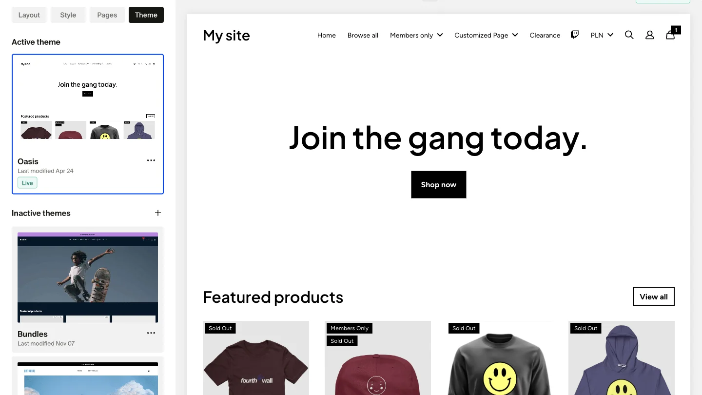
Previously added themes are saved under Inactive themes. To switch to one, click its three-dot menu and select Set as active theme.
Only your active theme can be edited. If you want to experiment without your visitors seeing changes, set your site to Coming Soon mode first.
For a deeper look at theme management, see Update your shop theme.
Customize colors
Color settings control the palette applied across your entire shop. Go to Site design > Style > Colors to adjust four global values:
- Primary: Buttons, links, and key interactive elements
- Background: The main background color of your site
- Text: Body text throughout your shop
- Text Over Primary: Text or icons placed on top of areas using the Primary color
Click any color block to pick a new shade or paste in a hex code. Changes show in the site preview before you save.

Dark mode
Enable Dark mode from the same Colors panel to switch your shop to a dark color scheme. This applies a dark theme to your shop pages without requiring you to manually adjust each color value.
Dark mode applies to your shop only. The Fourthwall creator dashboard does not change appearance.
For the full color and product appearance settings, see Customize your site colors and product appearance.
Customize fonts
Font settings let you control the typefaces used across your shop. Go to Site design > Style > Fonts. You'll find two font categories:
- Heading font: Titles, section headers, and large display text
- Base font: Body text, product descriptions, and smaller text throughout your site
Use the dropdown menus to choose from 1,000+ Google Fonts. You can also enable the option to display text in all uppercase.

Adjust font size scale
Below the font selectors, you'll find a font scale slider. Dragging it left or right makes all text on your site smaller or larger, proportionally. This affects both headings and body text at once. Preview the result in the right-hand panel before saving.
For full font customization details, including adding a custom font via CSS, see Change fonts on your site.
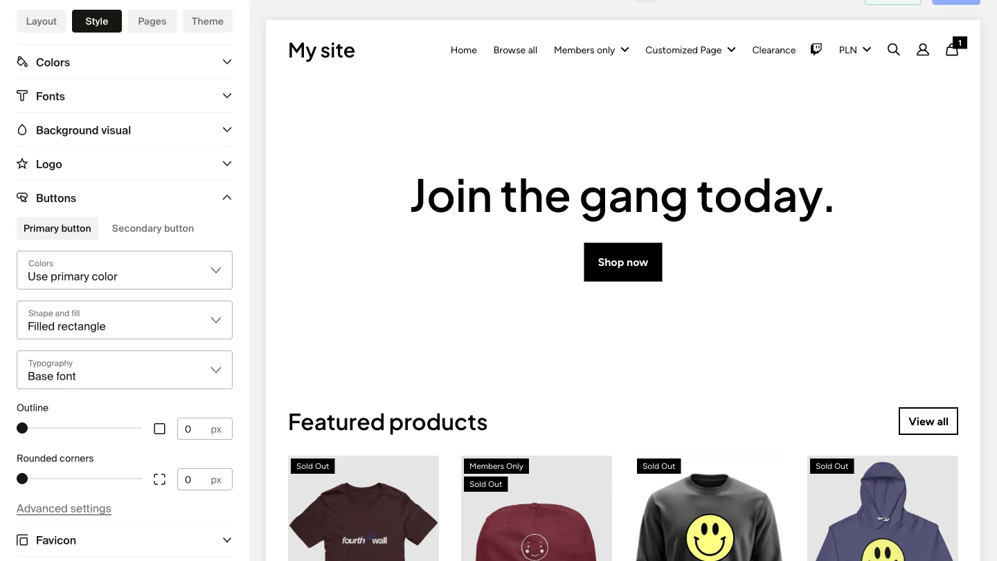
Customize buttons
Button settings control how buttons look across your shop, including shape, color, and hover effects. Go to Site design > Style and scroll to the Buttons section.
Your shop uses two button types:
- Primary buttons: Main calls to action, like "Add to Cart" or "Shop Now"
- Secondary buttons: Supporting actions that complement Primary buttons without competing for attention
Each type has its own tab with independent controls:
- Colors: Button background, text color, and hover states
- Shape and fill: Filled solid buttons or outlined buttons, plus corner radius (rounded, square, or pill)
- Typography: Font choice, size, and capitalization
For the full button customization reference, see Advanced button customization.
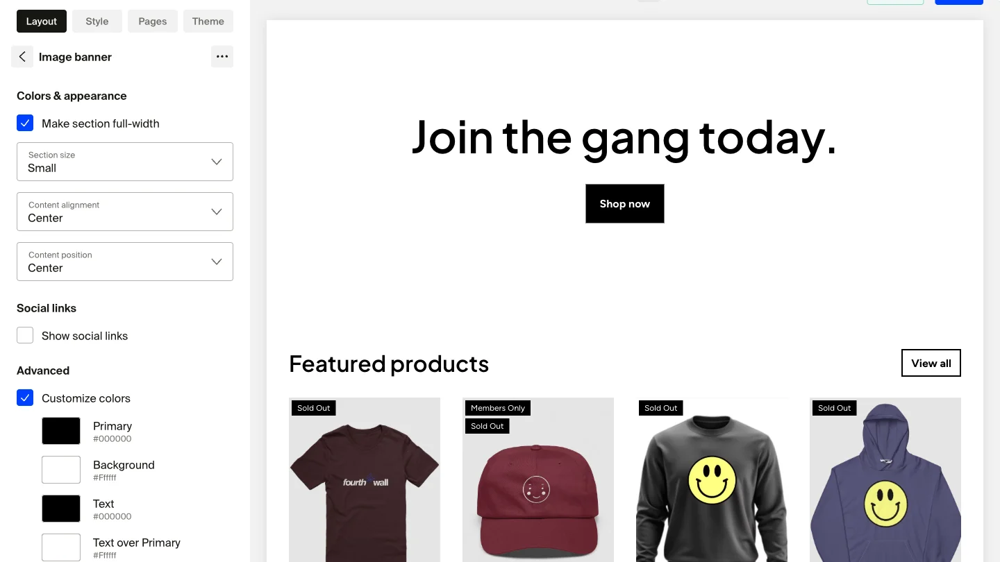
Global settings vs. per-section overrides
All color and font settings in the Style tab apply site-wide by default. You can also override them at the section level without any CSS.
To override settings for a specific section:
- Go to Site design > Layout.
- Click the section you want to customize.
- Look for color or font size override controls in the section's settings panel.
- Apply your changes to that section only.
Per-section overrides let you create visual contrast between sections, such as a dark banner above a lighter product grid. When you switch themes, per-section overrides are preserved.
Preview changes before saving
All style changes appear in the live preview panel on the right side of the site designer as you make them. You don't need to save to see how your changes look. Click Save only when you're happy with the result.

Use the desktop and mobile toggle in the preview panel to check how your style changes look on both screen sizes before saving.
Frequently asked questions
Will changing my theme remove my content?
No. Switching themes changes your site's visual design but does not delete any content, products, or section data. Your existing sections and pages carry over.
Can I undo style changes?
Yes. You can reset an individual theme to its default settings from the three-dot menu on the Themes page. You can also duplicate a theme before making changes so you have a backup copy.
Do per-section color overrides survive a theme switch?
Yes. Per-section overrides are stored separately from the global theme settings and are preserved when you switch themes.
Why don't I see a dark mode toggle?
The Dark mode toggle is in Site design > Style > Colors. If you don't see it, make sure you're in the Colors section and not another style accordion.
If you have any questions, do not hesitate to contact us at support@fourthwall.com.